My favorite use of AI is to build my own tools, either for work or for my personal projects. Come up with an idea, give it to Claude Code or your favorite LLM, and prototype! Maybe you’ll get nothing, maybe something you use only once in a while, or maybe you get something that makes your life noticeably better.
When I first started with AI, the lightbulb moment was the ease of prototyping. Then it was the ease of the build. Now it’s the ease of design. Not to say that design is easy, which it definitely is not, but you can have far more flexibility in when you apply it.
I spent years doing upfront planning, requirements, low-fi, high-fi, prototyping, and then locking in the design. Now when to do the design is fluid — it can come at the beginning, the middle, or the end, and usually all three. A complete change in design guidelines in the middle of a project may not be as devastating as it used to be. The back-end work is still a different beast, but the front end I can throw away and redo six times in an afternoon. It’s hard — for me, at least — to remember that.1
So my process is less a fixed sequence than a loop. Roughly:
- Brainstorm the idea with an LLM.
- Prototype it. Ugly is fine.
- Build it until it works.
- Iterate on the experience.
- Design — which has been happening all along, but this is where I go wild.
Brainstorm
Recently I wanted my own job board, something that would collect publicly available job postings and rank them against my skills. I’m sure there are apps like this already. I wanted my own.
Help me brainstorm how to build a job board that uses publicly available job posts and score them with my skills.
I attach my resume for reference, or point it at my second brain, and then there’s a lot of iterative back and forth to define the plan and requirements. My years in product development help here, especially on the back-end requirements, though I think you can get a long way if you can just explain well what you want. There’s a technical write-up on my work page if you want the pipeline.
Prototype and build
Within a day — maybe even minutes, maybe even one prompt — I had something running. It works! It’s a bit buggy, and rather blah looking. That’s fine. What I’ve had to learn is that working is the starting line, not the finish.
Iterate
Analyze the job board UX/UI and general experience. What improvements would add real value? Come up with a list of 10 to start.
What came back first was a bug that looked like a UX issue. Even though I’d been doing similar prompts for bug checks, the UX analysis caught a hidden one. I’ve had this happen before with similar application builds. What I like about this prompt is that it looks at what I actually built instead of what I meant to build.
Then I rank the list, fix, and ask again. I’ve kept that going for months on some projects.
Then go and play
This depends on how you’ve built your app, but a website like the job board can be re-themed with almost no effort. So I asked for several at once.
For fun, create the following themes: a Red Dwarf inspired theme. A Gangnam inspired theme of luxury and energy/movement. Web 2030 — imagine a future UX/UI. Edward Tufte inspired. My Space inspired. Situation Ops — the kind of thing you’d see spies using in a central command. These should contain the same jobs and data but be creative on the presentation.
And then, because the first pass was not that impressive, due to my weak prompt:
Even though the data needs to be the same, whether to use dropdowns, checkboxes, radials can all change. Tufte, for instance, might have a strongly different approach to the display of that data, especially compared to Red Dwarf’s Jupiter Mining Corp. Like these job adverts might say, show me your passion and dazzle me with your creativity.
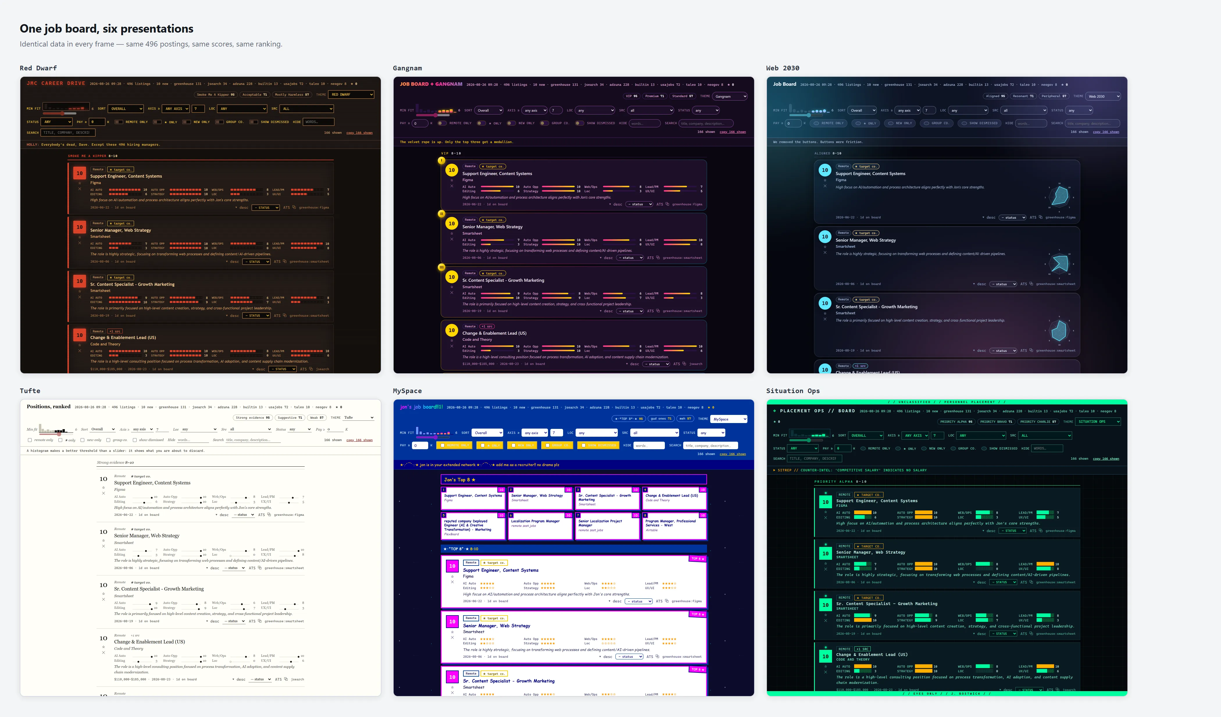
Red Dwarf’s amber terminal and Tufte’s white page are the same 496 postings.
When the same job card had to survive being a Tufte dot plot and a MySpace star rating and a row of block characters in a fake situation room, I found out what my data actually was.
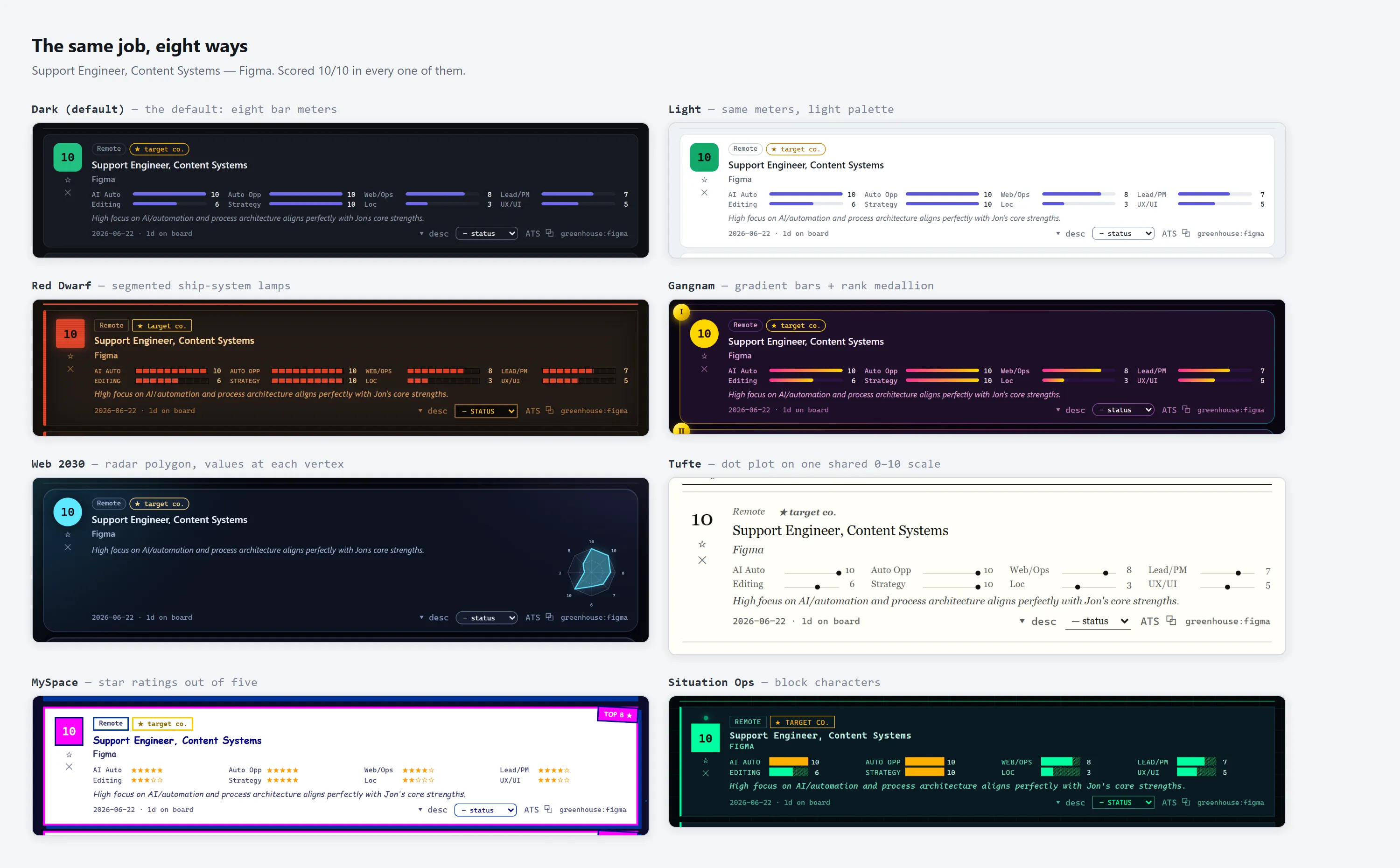
One job listing, one score of 10, six different styles applied.
Playing found real improvements. The board had a “minimum fit” slider — drag it to 7, see jobs scoring 7 and up. Sensible, but boring, and it didn’t occur to me to change it. During the fun pass it became a histogram of the actual score distribution that you click to set your floor.
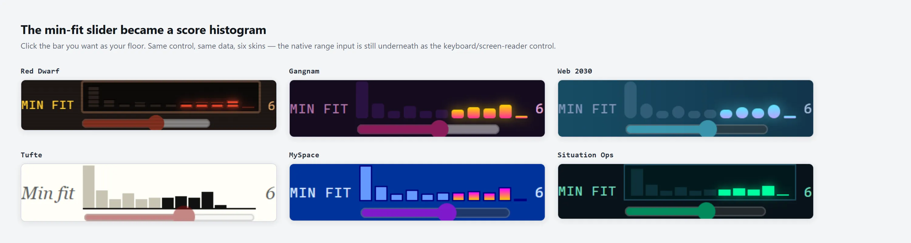
The cool control I didn’t think of or ask for, in six accents.
A slider doesn’t say anything. A histogram shows you what you’re about to throw away before you throw it away. Six jobs above your cut and forty below reads very differently from the reverse, and the slider was hiding that from me.
I would not have thought of that control. It came out of the same pass that produced a MySpace Top 8 and Red Dwarf Holly quotes, not from my corporate style prompts. And the classic Holly style announcements made the Red Dwarf page my instant favorite.
Still figuring it out
I don’t have this nailed down, and the order keeps moving. Honestly this is part of what makes AI-assisted work so exciting. There’s so much to learn! The next thing I want to try is role playing with the LLM, having it test my site as a particular user.
If you want to try any of it: think of a simple app that you use frequently but are frustrated with, or something that you don’t have at all but want. In this case, for me, a job board, but maybe I want my own workout app or simple word game. It’s your tool. Have fun!
Footnotes
-
I know AI has taken over my beloved em dashes, but I’m still going to use them. ↩